Palmer Penguins
Introduction to the Palmer Penguin Dataset
The Palmer Penguin dataset is a popular dataset for data analysis and visualization in R. It contains measurements of body weight, bill length, flipper length, and body mass for three different species of penguins: Adelie, Gentoo, and Chinstrap.
The dataset was collected by Dr. Kristen Gorman and the Palmer Station Long Term Ecological Research (LTER) program, which is part of the National Science Foundation (NSF). The data was collected during the breeding season from 2007-2009 at Palmer Station, Antarctica.
The Palmer Penguin dataset contains 344 observations and 8 variables:
species: The species of penguin (Adelie, Gentoo, or Chinstrap)island: The island where the penguin was observed (Biscoe, Dream, or Torgersen)bill_length_mm: The length of the penguin’s bill in millimetersbill_depth_mm: The depth of the penguin’s bill in millimetersflipper_length_mm: The length of the penguin’s flipper in millimetersbody_mass_g: The body mass of the penguin in gramssex: The sex of the penguin (male or female)year: The year the data was collected (2007, 2008, or 2009)
The Palmer Penguin dataset is a great dataset for exploring data visualization in R, as it contains a variety of numerical and categorical variables that can be used to create interesting and informative plots. In the following sections, we will explore some of the basic and advanced plots that can be created using the Palmer Penguin dataset and the ggplot package.
Load the Palmer Penguin dataset
You can load this package and dataset by running the following code in R:
# Load the palmerpenguins package
library(palmerpenguins)

# Load the penguins dataset
data("penguins")
Explore the Palmer Penguin dataset
Before we start visualizing the data, it is always a good idea to explore the dataset. We can do this by using various R functions to get an idea of the structure of the data. Here are some useful R functions:
# View the first few rows of the dataset
head(penguins)
# View the last few rows of the dataset
tail(penguins)# Get a summary of the dataset
summary(penguins)## species island bill_length_mm bill_depth_mm
## Adelie :152 Biscoe :168 Min. :32.10 Min. :13.10
## Chinstrap: 68 Dream :124 1st Qu.:39.23 1st Qu.:15.60
## Gentoo :124 Torgersen: 52 Median :44.45 Median :17.30
## Mean :43.92 Mean :17.15
## 3rd Qu.:48.50 3rd Qu.:18.70
## Max. :59.60 Max. :21.50
## NA's :2 NA's :2
## flipper_length_mm body_mass_g sex year
## Min. :172.0 Min. :2700 female:165 Min. :2007
## 1st Qu.:190.0 1st Qu.:3550 male :168 1st Qu.:2007
## Median :197.0 Median :4050 NA's : 11 Median :2008
## Mean :200.9 Mean :4202 Mean :2008
## 3rd Qu.:213.0 3rd Qu.:4750 3rd Qu.:2009
## Max. :231.0 Max. :6300 Max. :2009
## NA's :2 NA's :2# Get the number of rows and columns in the dataset
dim(penguins)## [1] 344 8Running the above code will give us a good overview of the Palmer Penguin dataset. We can see that the dataset has 344 observations and 8 variables, and that there are no missing values. We can also see the range and distribution of each variable, which can help us choose appropriate scales and axes when creating plots.
Data Visualization
Numerical summaries are useful for getting a general idea of the
data, but they often don’t tell the whole story. In this section, we
will explore how to create data visualizations using the
ggplot2 package. Data visualization is a powerful tool not
only for exploring relationships in the data, but also for communicating
your findings to others.
Introduction to ggplot
ggplot2 is a powerful data visualization package in R
that allows you to create beautiful and informative plots with
relatively few lines of code. The ggplot package is based on the
“Grammar of Graphics”, which is a framework for thinking about how to
construct visualizations from basic building blocks such as geometric
shapes, aesthetics, and scales.
The basic syntax for creating a plot with ggplot is as follows:
ggplot(data = <DATA>, aes(x = <X>, y = <Y>, color = <COLOR>, shape = <SHAPE>)) +
  <GEOM_FUNCTION>()
Here, data refers to the dataset you want to plot, aes
stands for aesthetics, and specifies how to map variables in the dataset
to visual properties such as x and y axis, color, and shape.
<GEOM_FUNCTION> refers to the type of plot you want
to create, such as geom_point() for a scatterplot or
geom_histogram() for a histogram.
Histograms
A histogram is a type of chart that is used to display the distribution of a dataset. It is a graph consisting of a series of rectangles (called bins) that are placed side-by-side along an axis (usually the x-axis). The height of each rectangle represents the number or proportion of data points that fall within a given range of values (called the bin width), and the width of each rectangle represents the size of the range.
Histograms are useful for understanding the shape of a distribution, as well as identifying outliers and clusters within the data. They can also be used to compare the distributions of different groups or variables within a dataset.
For example, a histogram of the body mass of penguins might show that the majority of penguins have a body mass between 3000 and 5000 grams, with a few outliers on either end of the distribution. By looking at the histogram, we can quickly get a sense of the overall shape and spread of the data.
Create a histogram of penguin body mass
Let’s use ggplot to create some visualizations of the Palmer Penguin dataset. We will start by creating a histogram of body mass
# Initialize the ggplot object with the penguins dataset
ggplot(data = penguins, aes(x = body_mass_g)) +
  # Create a histogram with 30 bins
  geom_histogram(bins = 30) +
  # Alternatively, you can specify the bin width. Uncomment this
  # line and comment out the line above to try it out!
  # geom_histogram(binwidth = 100) +
  labs(
    title = "Distribution of Body Mass for Palmer Penguins",
    x = "Body Mass (g)", y = "Count"
    ) # Every good plot needs a title and axis labels!
Try changing the number of bins in the histogram to see how it affects the shape of the distribution. Does this change your interpretation of the data?
There are other variables you could explore further, try changing the
x-axis variable to bill_length_mm or
bill_depth_mm and see what you find. Be sure to update your
axis labels accordingly!
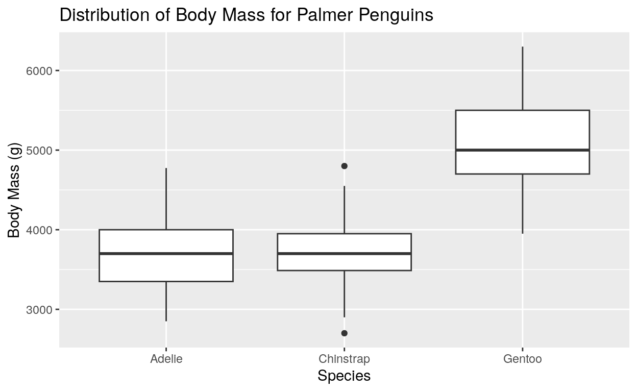
Box plots
Like histograms, box plots are a type of chart that is used to display the distribution of a dataset. However, they are more useful for comparing the distributions of different groups or variables within a dataset. They are also useful for identifying outliers and clusters within the data.
Box plots also show specific values such as the median (the middle value), the first quartile (the value that is greater than 25% of the data), and the third quartile (the value that is greater than 75% of the data). These are represented by the middle, top and bottom lines of the box, respectively. The whiskers represent the range of the data, and the outliers are represented by the points outside of the whiskers.
Let’s create a box plot of the body mass of the penguins, grouped by species:
# Initialize the ggplot object with the penguins dataset
ggplot(data = penguins, aes(x = species, y = body_mass_g)) +
  # Create a boxplot
  geom_boxplot() +
  labs(
    title = "Distribution of Body Mass for Palmer Penguins",
    x = "Species", y = "Body Mass (g)"
    )
Try changing the x-axis variable to sex or
island and see what you find. Be sure to update your axis
labels accordingly!
Scatterplots
Histograms and boxplots are useful for understanding the distribution of a single variable, but what if we want to explore the relationship between two variables? Scatterplots are a great way to visualize the relationship between two numerical variables. They are useful for identifying outliers, clusters, and trends in the data.
A scatter plot is a type of chart that is used to display the relationship between two variables. It is a graph consisting of a series of points, where each point represents a single observation in the dataset. The x-axis represents one variable, and the y-axis represents the other variable. Scatter plots are useful for identifying patterns, trends, and outliers in the data, as well as visualizing the strength and direction of the relationship between the two variables.
Let’s start with a basic scatter plot that displays the relationship between the body mass and flipper length of the penguins:
Create a scatterplot of body mass and flipper length
ggplot(
    data = penguins,
    aes(x = body_mass_g, y = flipper_length_mm)
  ) +
  geom_point()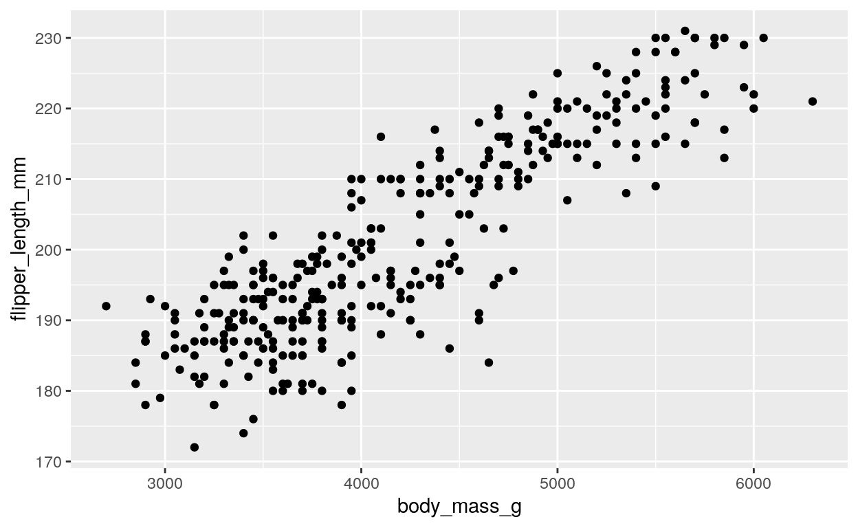
Here we specify that the x coordinate represents the body mass, while
the y coordinate represents the flipper length. The
geom_point() function is then used to add points to the
plot, with each point representing a single observation in the
dataset.
This plot shows that there is a positive relationship between body mass and flipper length, with larger penguins having longer flipper lengths. We can also try exploring other variables in the dataset, such as the bill length and depth. Try changing the x and y variables in the code above to see what you find! For reference, here is a list of the variables in the dataset:
## [1] "species"           "island"            "bill_length_mm"
## [4] "bill_depth_mm"     "flipper_length_mm" "body_mass_g"
## [7] "sex"               "year"
Adding additional information to the plot
So far, we have created a scatter plot that shows the relationship between body mass and flipper length for all penguins in the dataset. However, what if there are different relationships between these variables for different species of penguins? To address this issue, we can use color, size, and shape to add additional information to the plot. For example, we can use color to indicate the species of the penguins:
ggplot(
    data = penguins,
    aes(x = body_mass_g, y = flipper_length_mm, color = species)
  ) +
  geom_point()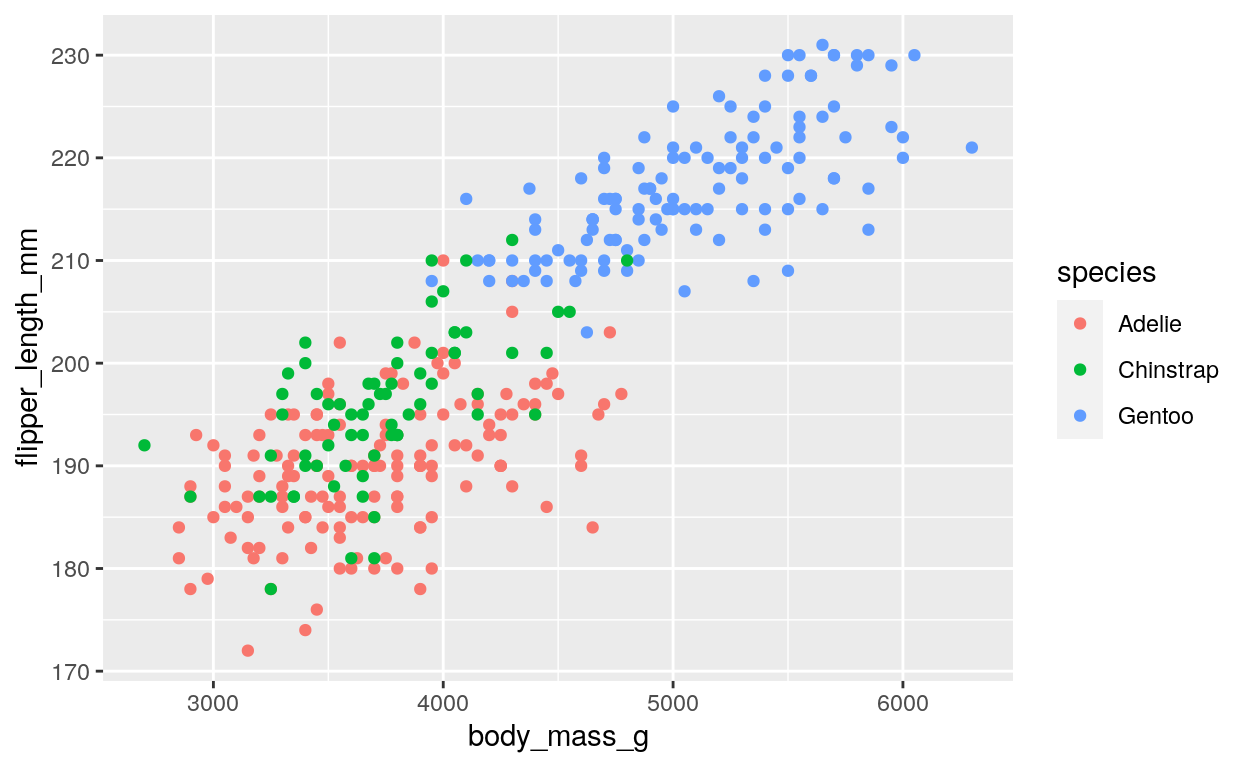
Here we add the color = species argument to the
aes() function, which tells ggplot() to use
the species variable to determine the color of each point
on the plot.
We can also use the size of points to indicate another variable in the dataset. For example, we can use size to indicate the bill depth of the penguins:
ggplot(
    data = penguins,
    aes(
      x = body_mass_g, y = flipper_length_mm,
      color = species, size = bill_depth_mm
    )
  ) +
  geom_point()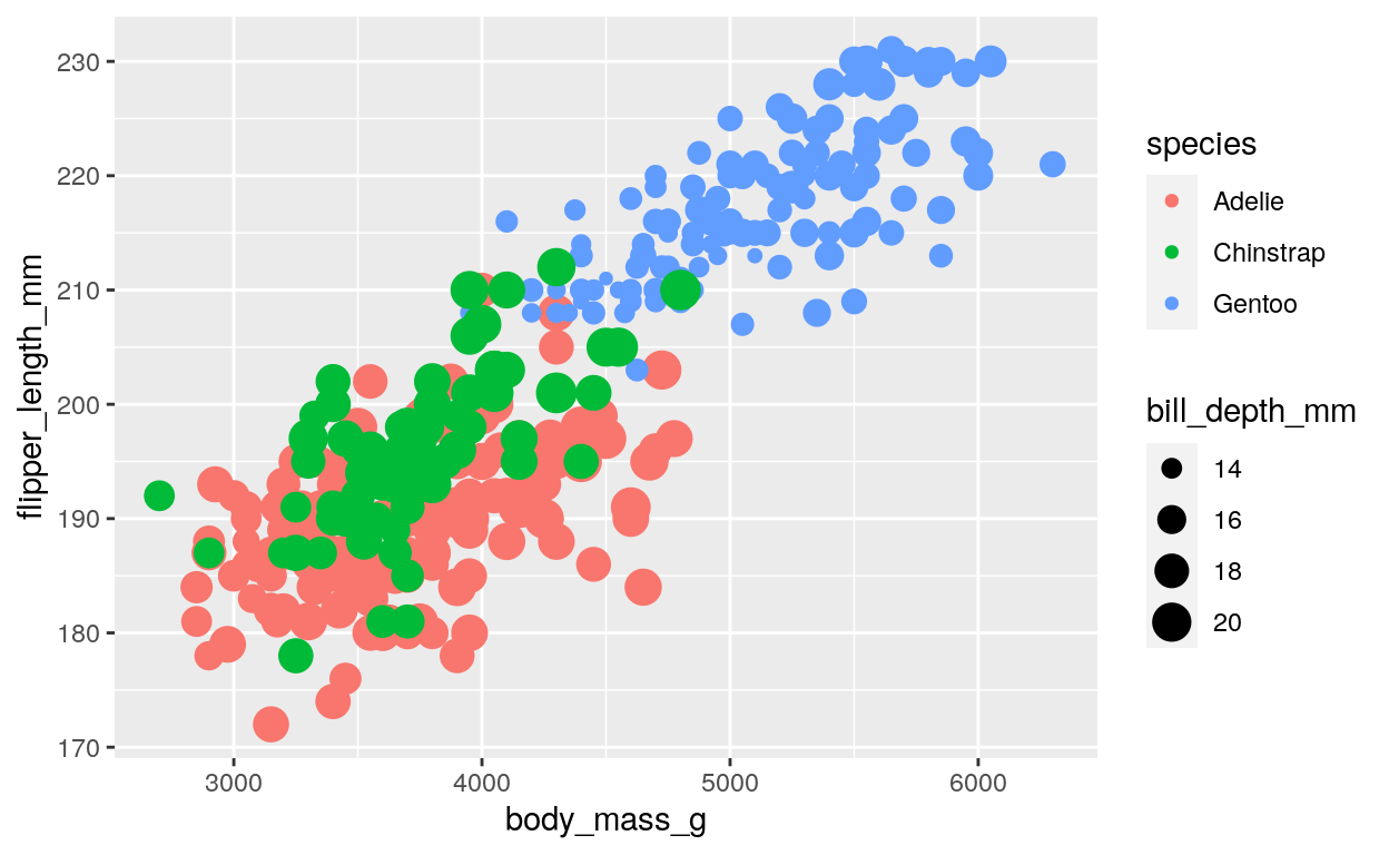
This code adds the size = bill_depth_mm argument to the
aes() function, which tells ggplot() to use
the bill_depth_mm variable to determine the size of each
point on the plot. This plot shows that there is some variation in bill
depth within each species, but that Gentoo penguins tend to have the
smallest bill depth.
Finally, we can use shape to add another dimension of categorical information to the plot. For example, we can use shape to indicate the sex of the penguins:
ggplot(data = penguins, aes(x = body_mass_g, y = flipper_length_mm, color = species, size = bill_depth_mm, shape = sex)) +
  geom_point()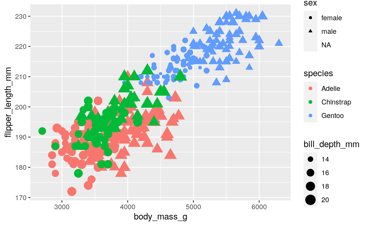
This code adds the shape = sex argument to the aes() function, which tells ggplot() to use the sex variable to determine the shape of each point on the plot. This plot shows that male and female penguins have different shapes, with triangles representing males and circles representing females. It also shows that there is some overlap between the sexes for each species, but that male penguins tend to have larger body mass, flipper length, and bill depth than female penguins for all three species.
Conclusion
In this tutorial, we learned how to use ggplot2 to create histograms, boxplots, and scatterplots. We also learned how to add additional information to our plots using color, size, and shape. These plots can be used to explore the distribution of a single variable, as well as the relationship between two variables.